Feel free to reach out:
hello@atomik.studio

October 24, 2026
Premium has become a familiar visual language in Dubai. That doesn't make it the right positioning for every business.
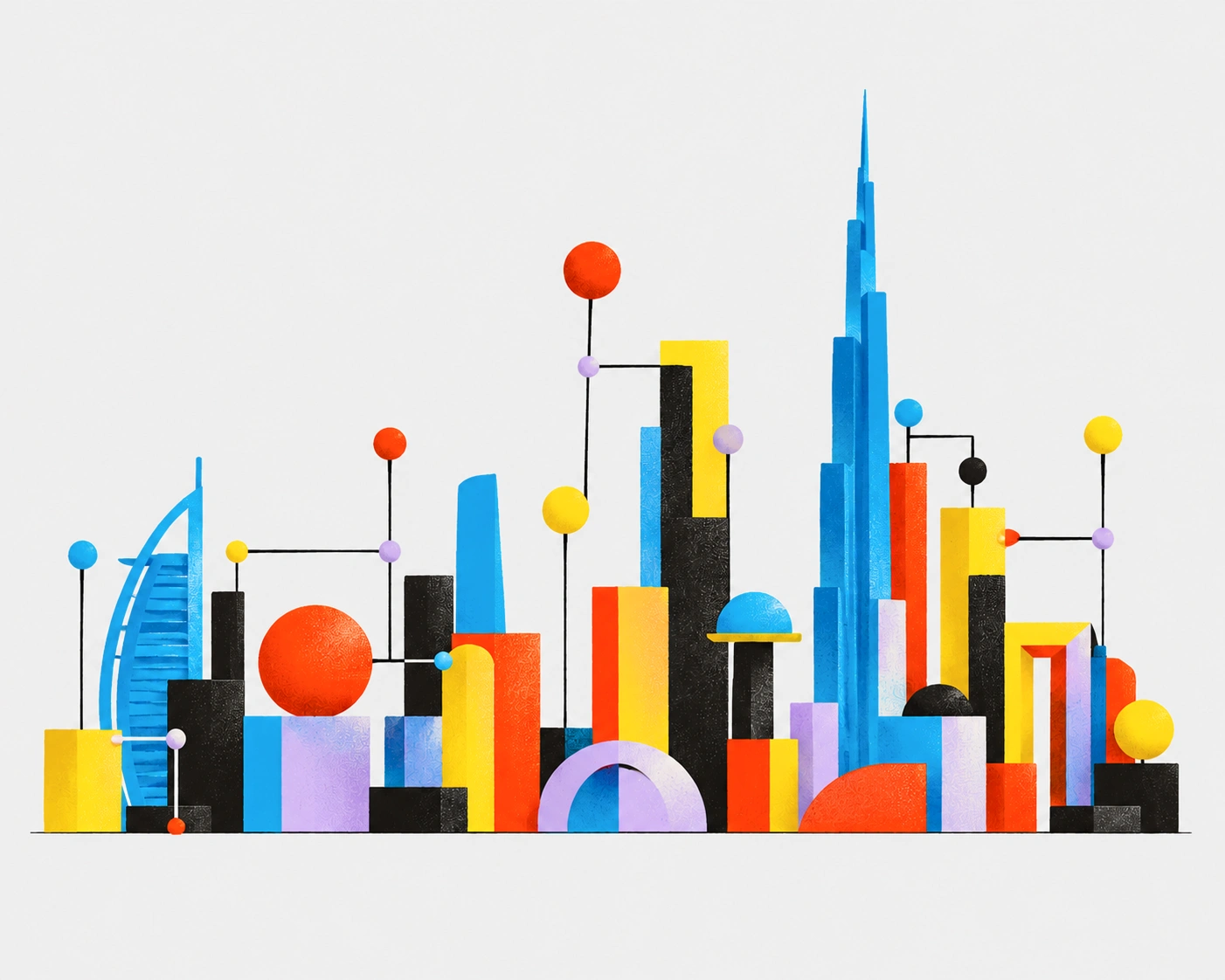
Dubai has developed a fairly recognisable visual language for success.
Elegant typography, restrained colour palettes, polished photography and a certain confidence in how brands present themselves.
You'll find variations of this approach across real estate, hospitality, wellness, professional services and increasingly, businesses that have little in common with those industries.
There's nothing inherently wrong with looking premium. For many businesses, it's entirely appropriate.
But I do wonder how often that direction comes from a genuine positioning decision rather than an assumption about what a successful brand in Dubai should look like.
Dubai has built much of its international reputation around ambition, luxury and exceptional experiences. It's understandable that businesses operating here would want to associate themselves with those qualities.
The challenge is that premium positioning has developed a predictable visual vocabulary. Minimalist identities, understated colours, carefully art-directed imagery and generous amounts of space can all communicate sophistication.
But when those choices become the default, they gradually lose their ability to differentiate.
I've previously written about why brand identities in Dubai are starting to look alike. Familiar conventions are useful. They help audiences recognise categories and understand what a business offers. But following them too closely can make it difficult for a brand to establish its own character.
A brand can look polished, professional and expensive while giving people very little reason to remember it. It's closely related to the problem of designing by consensus: familiar choices are easy to agree on, even when they don't help a brand stand apart.
The objective shouldn't be to avoid conventions altogether. It should be to understand which ones serve the business and where there's room to do something different.
Imagine a business offering accessible, practical services to a broad audience. Its competitive advantage might be convenience, straightforward pricing or a more approachable customer experience.
Now imagine that same business adopting the visual language of an exclusive luxury brand.
The identity might look impressive, but it could also communicate something the business never intended. Potential customers might assume the service is expensive, complicated or designed for someone else.
A visual identity shapes expectations before anyone experiences the offering.
A business shouldn't need to appear luxurious to be perceived as credible. Expertise, reliability, accessibility and simplicity can be equally valuable reasons for customers to choose one company over another.
Sometimes a direct, practical or expressive brand might be better aligned with the business than another understated identity.
If a business presents itself as exclusive, people may expect a corresponding level of attention, personalisation and service. When the experience doesn't match those expectations, the premium appearance can become a disadvantage.
When developing a brand, I prefer to understand what gives a business its advantage before exploring how it should look.
Who is the offering for? What alternatives are available? Why would someone choose this business? And what should people understand about it before making that decision?
These questions should inform the creative direction, rather than beginning with an aesthetic and trying to justify it afterwards.
Two hospitality businesses might serve entirely different audiences. One might compete through exclusivity and highly personalised service. Another might focus on convenience, affordability and informality. Both can succeed. Neither needs to borrow the other's positioning.
The same applies to professional services, wellness, technology and real estate.
There's also a commercial consideration. Building a premium brand involves more than investing in sophisticated design. Pricing, customer service, environments and other interactions all need to support the position.
As I argue in before investing in branding in Dubai, the first decision is what actually needs to change, not which new identity would look best.
An expensive-looking identity is relatively easy to create. Building a business that consistently meets the expectations it creates is considerably harder.
It's easy to respond to visual sameness by suggesting that brands should become louder, bolder or more experimental.
That isn't always the answer either.
A distinctive identity can be restrained. It can be familiar. It can even share visual conventions with competitors. What matters is whether those decisions support a clear and relevant position.
A brand that understands its audience and offering has more freedom to make appropriate creative choices rather than relying on what's popular.
Premium can be a valuable position. But it isn't automatically the strongest one.
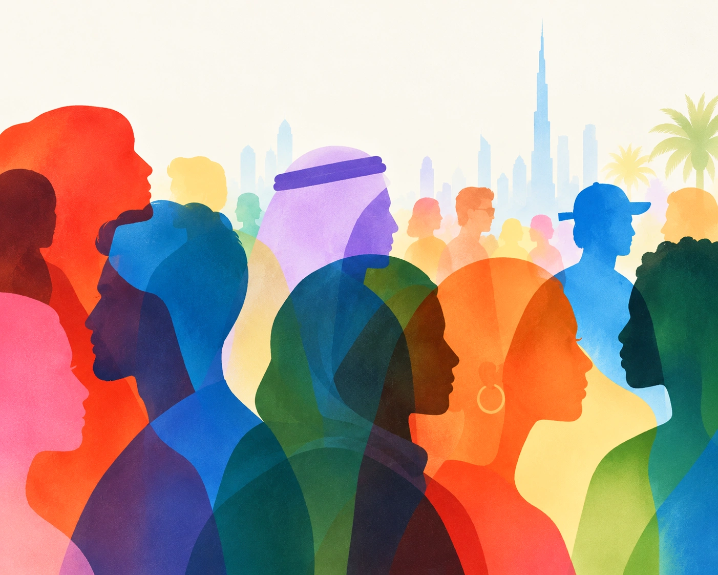
In a city with as many different businesses, audiences and opportunities as Dubai, there's little reason for every brand to pursue the same idea of success.

Francisco Belo dos Santos shapes brands through strategy, identity and digital experiences. Based in Dubai and born in Lisbon, he brings an international perspective shaped by diverse cultures and markets, combining strategic thinking with a belief in purposeful design.

Francisco Belo dos Santos shapes brands through strategy, identity and digital experiences. Based in Dubai and born in Lisbon, he brings an international perspective shaped by diverse cultures and markets, combining strategic thinking with a belief in purposeful design.
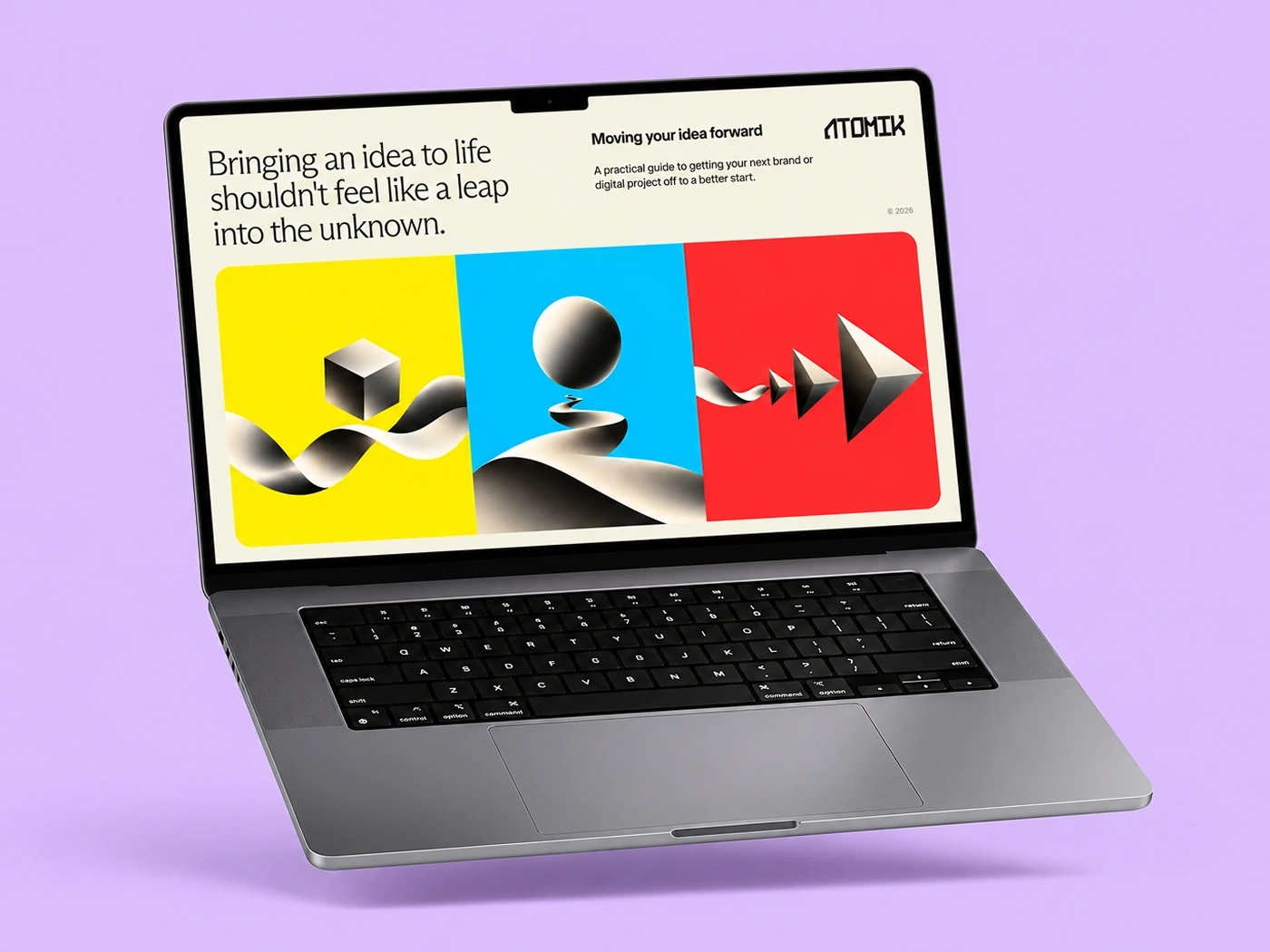
Enjoy a free, practical guide to help you define your challenge and prepare for your next branding or design project, complete with useful checklists.
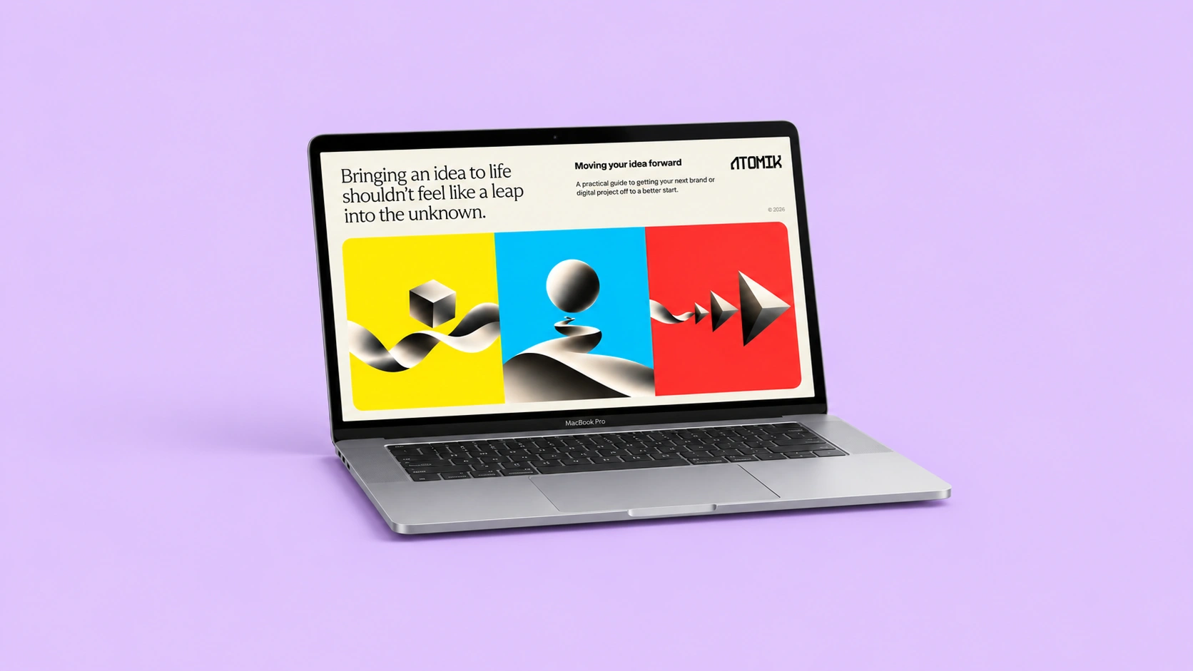
A free, practical guide to help define your challenge and prepare for your next branding or design project.