Feel free to reach out:
hello@atomik.studio
October 22, 2026
A good set of guidelines should make people more confident using a brand, not more dependent on the designers who created it.
A brand can have a carefully designed identity and a hundred-page guidelines document, yet struggle to look and sound consistent six months after launch.
The problem isn't always the design. Sometimes the files are difficult to find. Sometimes the examples bear little resemblance to everyday work. Sometimes every decision still needs the original designer's approval.
Good guidelines should make a team more capable, not more dependent. They pass on enough of the thinking behind an identity for other people to put it to work.
This guide looks at what to include, what to leave out and how to create guidelines that people will actually use.
Brand guidelines document how a business should express its identity. They define the visual and verbal elements that make it recognisable and explain how to use them across different situations.
The best ones answer more than which logo goes where. What should always feel consistent? Where is there room to adapt? How does someone make a good decision in a situation the designer didn't anticipate?
A document cannot contain every future social post, presentation, product screen or campaign. It can give the people making those things a reliable starting point.
Guidelines aren't the brand itself. They're a way of helping people work with it.
Logo clear space, font sizes and colour specifications are useful. But a rule can be followed without being understood.
If the brand needs to make a complicated service feel accessible, its typography, layouts and writing should help people understand it. Explaining that principle gives a team some direction when a template doesn't fit.
The rules should support the position the business wants to occupy, rather than simply document an aesthetic preference.
Nobody needs a lecture in strategy before preparing a proposal. But a short explanation of the intention can make a considerable difference to the decisions they make.
The scope depends on how the brand operates. A small consultancy with a handful of touchpoints doesn't need the same documentation as an organisation with several markets, agencies and internal teams.
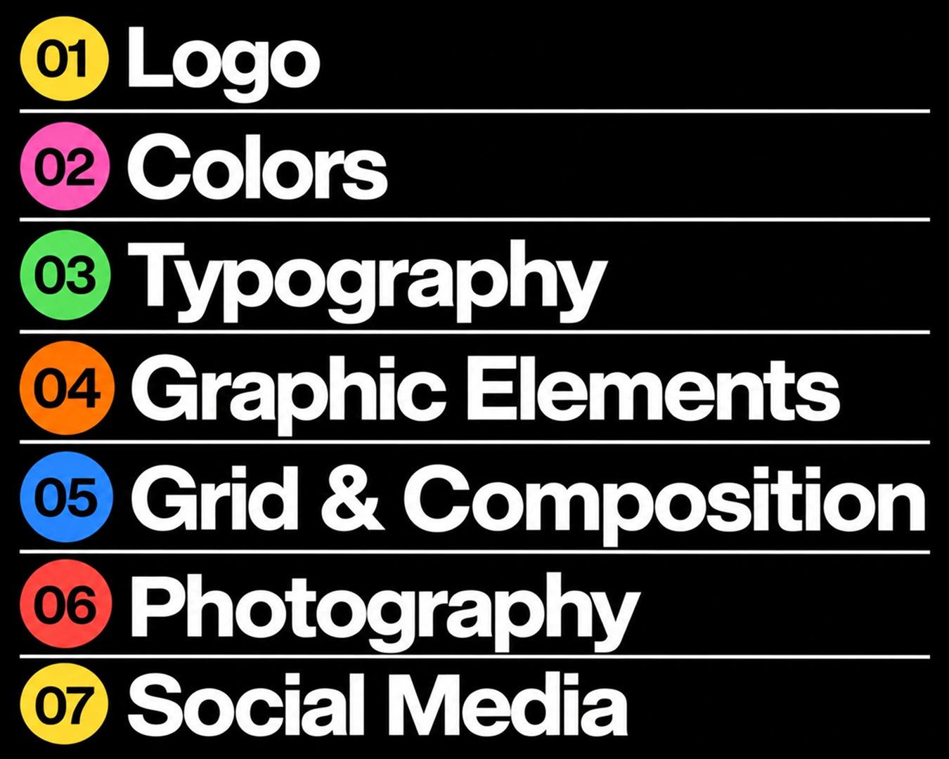
Most guidelines need a clear explanation of the brand's direction, logo usage, typography, colour, imagery, graphic elements, voice and tone, and examples of the most common applications.
For logos, explain variations, size, spacing and what to avoid. For typography, show real hierarchy and readable combinations. For colour, establish roles and accessible contrasts, not just a list of codes. For imagery, describe how to choose and compose photographs or illustrations.
Voice and tone deserve more than a collection of adjectives. Show how the business explains a product, welcomes someone, responds to a complaint or writes an error message.
Include links to approved assets, templates and the people responsible for maintaining them. These small practical details are often what determine whether anyone opens the guidelines twice.
Above all, document the elements that build recognition across the system. What remains recognisable beyond the logo is at least as important as where the logo sits.
It's easy to make an identity look good in carefully art-directed mock-ups. Everyday materials are less cooperative.
Someone will need a presentation with too much text, a social graphic with a weak photograph, a customer email or a mobile page with three competing messages.
Use real content when developing examples. Show what happens with long headings, multiple information levels, constrained formats and applications produced by people who aren't designers.
Instead of only showing what not to do, explain the better alternative. If the preferred layout doesn't work, what should someone try next?
The same lesson applies to planning a website. The content, people and responsibilities need to be considered before the design reaches its most polished state.
A brand should feel recognisable without repeating the same composition everywhere.
A technical report, an outdoor advertisement and a customer support message have different jobs. Forcing them into one formula can make the brand feel rigid or make the communication less useful.
Decide what must remain stable and what can change. A particular colour relationship might be recognisable while the layout adapts. The voice might remain direct while the tone changes with the situation.
This matters in multicultural markets too. Arabic and English may require different typographic considerations, writing lengths and layouts. Adaptation should be designed into the system, not left until after everything else is approved.
In a market like Dubai, where familiar premium conventions can make very different identities look alike, consistency should protect what makes a brand distinctive, not reinforce a fashionable formula.
Visual identity tends to occupy most of a brand manual. Language often receives a page saying the brand should sound confident, human and approachable.
Those are reasonable ambitions. They're also difficult to apply without examples.
Show how the brand communicates differently in advertising, service messages, sales material and difficult conversations. Establish preferred terminology, useful writing principles and a few examples with context.
The voice can remain recognisable while the tone adjusts to the audience and moment. A message about a delayed order shouldn't sound exactly like a celebratory product launch.
If teams regularly produce multilingual content, include guidance for translation and local adaptation rather than expecting the original English phrasing to survive unchanged.
Brand guidelines and digital design systems overlap, but they aren't interchangeable.
Brand guidelines describe the identity and how it should behave. A digital design system can translate parts of that identity into reusable components, spacing rules, design tokens, interaction patterns and accessibility standards.
The connection matters. If marketing, product and development interpret the same brand independently, the website can end up feeling unrelated to the product.
Not every organisation needs a large component library. But the principles should carry through into the tools and experiences where people encounter the business.
This is where connecting identity with the wider customer experience becomes part of the work.
A PDF is sometimes enough. There's no point building a complex brand platform for a small identity with limited applications.
As a business grows, though, static files can become difficult to manage. Old assets survive in shared folders. Nobody knows which version is current. The guidelines become something teams refer to only when there's a disagreement.
An online resource can make useful standards and approved files easier to search and maintain. But a digital platform is no solution if nobody takes responsibility for updating it.
Think about the people who will use the material. A marketing manager looking for a slide template shouldn't need to browse forty pages of design philosophy.
The best format is the one the business will return to and can afford to maintain.
Guidelines don't become useful merely because they have been delivered.
Bring the people who will use them into the process. Ask someone outside the creative team to prepare a real application. Notice where they hesitate, what they can't find and which rules need explaining.
A short induction and a clear asset structure can be more valuable than an extra chapter of specifications.
This is another example of how good branding needs contributions from both sides. A designer can develop the system, but the business has to understand it, use it and maintain it.
The handover should transfer confidence, not create a permanent approval queue.
New channels, products and audiences will create situations the original document didn't anticipate. That's normal.
Assign someone to own the guidelines. Decide who reviews new applications, how changes are approved and where updated assets are stored.
Don't rewrite the identity every time someone has a new idea. Equally, don't defend an outdated rule simply because it appears in the original document.
The goal is continuity, with enough flexibility to improve how the brand works.
Before handover, ask whether someone can:
If the answers aren't clear, another twenty pages of rules probably won't help. Better examples, simpler navigation or a conversation with the people using the brand might.
A successful brand identity needs to work long after its launch presentation.
The measure of good guidelines isn't how comprehensive the document looks. It's whether someone can open it, find what they need and produce something that feels unmistakably like the brand.
Good guidelines don't just protect an identity. They help people carry it forward.

Francisco Belo dos Santos shapes brands through strategy, identity and digital experiences. Based in Dubai and born in Lisbon, he brings an international perspective shaped by diverse cultures and markets, combining strategic thinking with a belief in purposeful design.

Francisco Belo dos Santos shapes brands through strategy, identity and digital experiences. Based in Dubai and born in Lisbon, he brings an international perspective shaped by diverse cultures and markets, combining strategic thinking with a belief in purposeful design.
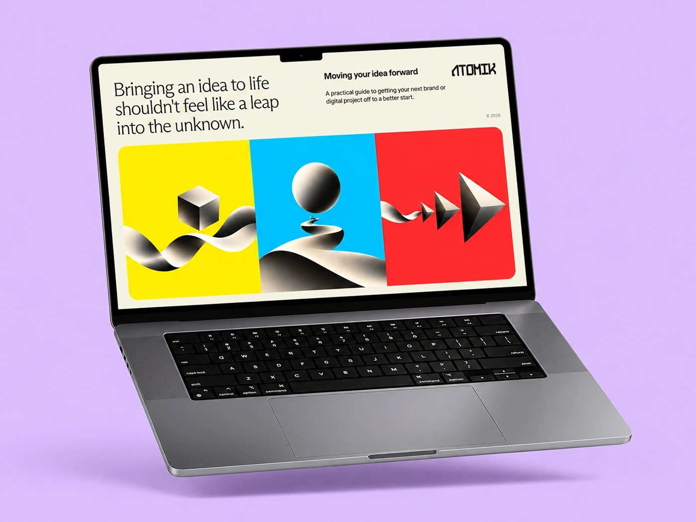
Enjoy a free, practical guide to help you define your challenge and prepare for your next branding or design project, complete with useful checklists.