Feel free to reach out:
hello@atomik.studio
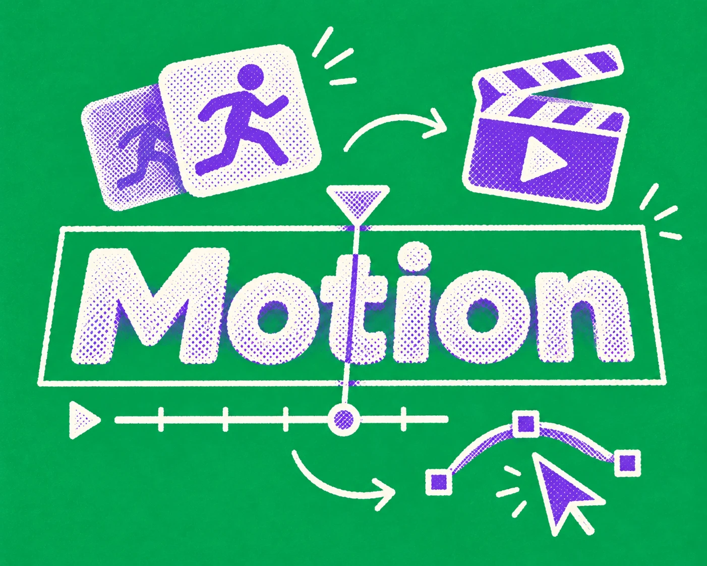
A logo can be recognisable in a static image. But what happens when it moves?
Does it appear instantly or build gradually? Does it feel measured or playful? Does it respond quickly, stretch, bounce or almost disappear before settling into place?
These decisions influence how people experience an identity, often without consciously noticing them.
Motion is becoming part of everyday brand communication. Websites, digital products, advertising, social content and physical environments all provide opportunities for identities to move.
Yet motion is still frequently considered after the main identity has been approved. The designer receives a logo, some colours, a typeface and a request to make something animated.
A more useful approach is to define how the identity behaves as part of the brand identity itself.
Motion branding is the use of movement, timing and transitions to express a brand's character and create recognisable behaviours across different touchpoints.
It can include animated logos, typography, graphic elements, interface transitions, campaign assets and moving imagery.
An identity doesn't need to move constantly. Motion should have a role.
A financial brand might use controlled, precise transitions to reinforce clarity and confidence. A children's entertainment brand may benefit from more playful and elastic movement. A technology company might use motion to communicate relationships between information, rather than simply making its interface feel futuristic.
These are creative possibilities, not rules for entire categories. The right direction comes from the brand's positioning, personality and the situations in which people encounter it.
Start with a few principles that describe how the brand should move.
Words such as energetic, calm or confident are useful starting points, but they're too broad to direct animation on their own.
Translate them into observable behaviour.
A calm identity might use shorter distances, restrained acceleration and transitions that don't demand attention. An energetic identity might rely on sharper changes in pace, directional movement and more pronounced contrasts between stillness and action.
Test these interpretations with the same elements. Animate a headline, a simple shape and a transition between two compositions.
The aim is to discover which behaviours feel appropriate and recognisable.
Three or four well-defined principles are usually more useful than a long list of adjectives.
Two animations can move between exactly the same positions and feel completely different.
Timing determines how long a movement takes. Easing determines how its speed changes during that movement.
A linear movement maintains a constant speed. Ease-out decelerates towards the end. Spring-based animation can overshoot and settle into position.
Consider the context before assigning values.
A small interface response should usually be quick enough to confirm an action without delaying the user. A campaign animation may have more freedom to build anticipation or hold attention.
For an initial digital prototype, a team could test fast feedback of roughly 100–200 milliseconds for small state changes; interface transitions of around 200–400 milliseconds for navigation and component changes; and longer expressive sequences where storytelling or comprehension justifies the duration.
These are starting points for testing, not universal standards.
Document the intended easing curves alongside durations. A specification that only says 'smooth animation' leaves far too much to interpretation.
A motion identity becomes more useful when it contains a small vocabulary of repeatable behaviours.
Consider how elements enter and leave a composition, how typography reveals itself, how shapes transform and how different parts of the system respond to one another.
The movements should relate to the visual identity.
A brand built around a strong geometric symbol might use its proportions to determine transitions. Another identity could extend the rhythm of its typography into the timing of text reveals.
A useful example comes from Buff Motion's work for Starling Bank. What began as a series of social films developed into a wider motion framework, giving the brand principles it could apply beyond individual assets.
A collection of animations can look impressive without forming a system. Shared behaviours make new applications easier to create and help the identity remain recognisable.
Movement can make an interface more understandable.
A menu that expands from its trigger helps people understand where the new content came from. A clear transition between two states can establish continuity. Feedback following a completed action confirms that something has happened.
But motion can also make simple tasks unnecessarily slow.
An elaborate page transition may look impressive the first time someone encounters it. By the tenth visit, it can become an obstacle between the visitor and the information they need.
Good website content architecture helps people find what matters. Animation should support that structure, not compensate for confusing navigation.
Ask what the movement communicates.
If removing it makes the interface harder to understand, it probably serves a purpose. If removing it simply makes the experience faster, reconsider whether it needs to be there.
Not every brand needs a sonic identity, but movement and sound can reinforce one another.
A transition can have a rhythm. A visual reveal can respond to an audio cue. An animation might borrow its pace from speech, music or the sounds associated with a product.
The October 2026 Apple Music identity offers an unusual example. Its visual language was developed through physical experiments with sound and mineral oil, allowing audio to influence the visual expression rather than simply accompany it.
Sound should remain appropriate to the environment. A branded film can use it deliberately. A website shouldn't depend on audio to explain basic functionality.
Design the relationship between movement and sound where it adds something, while ensuring the visual experience can still communicate independently.
Movement affects people differently.
Rapid transitions, large-scale zooming, parallax effects and unexpected animation can cause discomfort for users with vestibular disorders. Repeated movement may also make information harder to follow.
Accessibility needs to influence the motion system from the beginning.
The W3C guidance on animation from interactions recommends allowing people to disable non-essential motion triggered by interaction. It forms part of WCAG 2.2 at Level AAA.
For websites, the CSS prefers-reduced-motion media feature can detect when someone has requested less movement through their device settings.
A reduced-motion experience doesn't necessarily need to remove every transition. Large movements could become simple fades or immediate state changes, while essential feedback remains available.
Avoid relying on movement alone to communicate information. Loading states, progress and completed actions should have understandable visual alternatives.
Accessibility also means giving users appropriate control. Autoplaying sequences, animations that interfere with reading and unnecessarily prolonged transitions deserve scrutiny.
A motion identity designed only for a polished showreel is unlikely to survive everyday use.
Test it on the formats the organisation actually needs.
That could include vertical social media content, website components, presentation templates, digital signage, advertising and product interfaces.
Different applications impose different constraints.
A five-second digital advertisement needs to communicate quickly. A website interaction must respond to the user. A presentation may need simpler transitions that colleagues can reproduce without specialist software.
Develop examples with real text lengths, content changes and device sizes. Consider how motion behaves when the language changes, particularly for identities used in both Arabic and English.
Not every animation needs a bespoke production process. A practical system should also include simpler options that teams can use regularly.
Motion guidance belongs alongside the rest of the brand guidelines.
Document what the movement is intended to communicate and how to reproduce it.
Depending on scope, include core motion principles, timing ranges, easing curves, entrance and exit behaviours, typography animations, reduced-motion alternatives, approved logo exports, editable templates and specifications for digital products.
Include examples of inappropriate use, particularly where motion becomes distracting, inconsistent or unnecessarily complicated.
A developer needs different information from a motion designer. Someone producing a presentation needs something different again.
Provide assets and instructions in formats those people can actually work with.
Motion can be difficult to judge when presented as an isolated sequence against a neutral background.
Test it in context.
Put the animation in a real webpage, a mobile interface, an advertisement or a presentation. Observe whether it makes information clearer, improves recognition or helps the experience feel more coherent.
Watch how people respond when they encounter the same behaviour repeatedly.
An animation that feels impressive during a presentation may be exhausting in everyday use. Another that appears almost unremarkable in isolation might make a digital product considerably easier to understand.
Review technical performance too. Heavy animation can introduce delays, particularly on less capable devices or slower connections.
The work needs to perform as well as it looks.
Motion doesn't need to make a brand louder.
Sometimes the most appropriate movement is subtle, precise and almost unnoticed. Other identities have room for more expressive behaviour.
The measure is whether it belongs to the brand and works in the places where people encounter it.
When movement is considered from the beginning, it becomes another recognisable part of the identity, rather than something added every time a designer is asked to make a logo move.
What is the difference between motion design and motion branding?
+Motion design is the broader discipline of creating movement in visual communication. Motion branding applies it to a specific identity, establishing behaviours that reinforce the brand across applications.
Does every brand need a motion identity?
+Not necessarily. A business with limited digital or audiovisual communication may only need a few simple rules. Brands with active digital products, campaigns and screens can benefit from a more developed system.
When should motion be developed during a branding project?
+Ideally, during identity development. Early motion exploration can influence typography, graphic elements and layout. Waiting until the end may limit the possibilities or produce animations disconnected from the identity.
How do you make motion branding accessible?
+Avoid unnecessary movement, provide reduced-motion alternatives, respect device preferences and ensure information doesn't depend entirely on animation. Test the result with different users and devices.

Francisco Belo dos Santos shapes brands through strategy, identity and digital experiences. Based in Dubai and born in Lisbon, he brings an international perspective shaped by diverse cultures and markets, combining strategic thinking with a belief in purposeful design.

Clarify your challenge, set priorities and prepare a brief for your branding or design needs.
Strategy, identity and digital experiences come together in different ways. Here's a selection of projects shaped by different challenges, ambitions and opportunities.
Explore selected projects ↗Developing something new, rethinking an existing brand or considering a different direction? Tell me what you're working on and we'll take it from there.
Start a conversation ↗