Feel free to reach out:
hello@atomik.studio
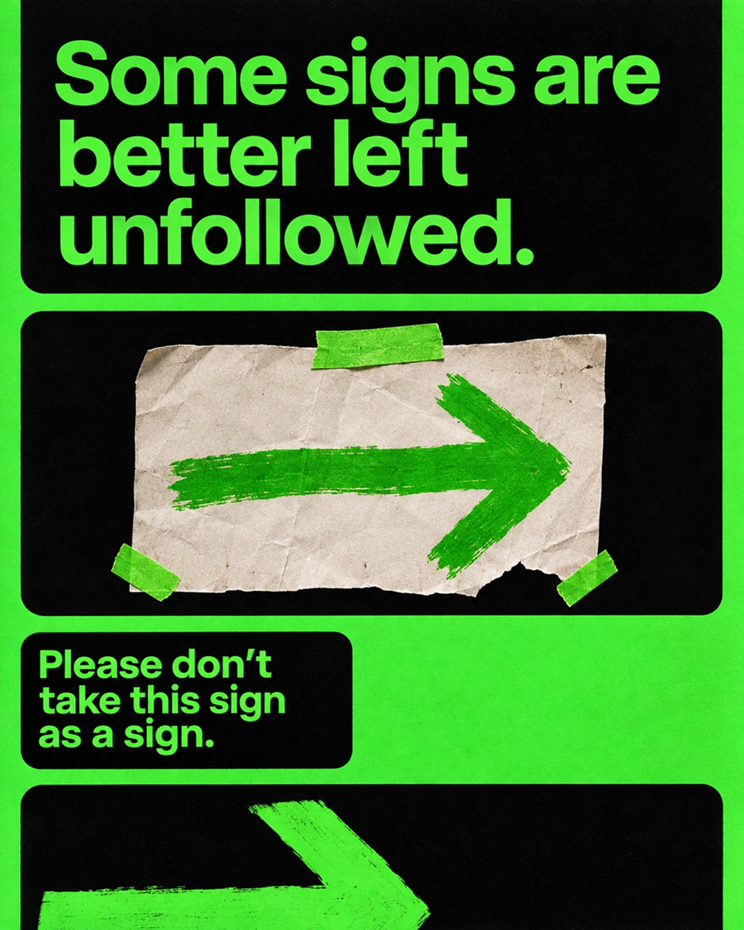
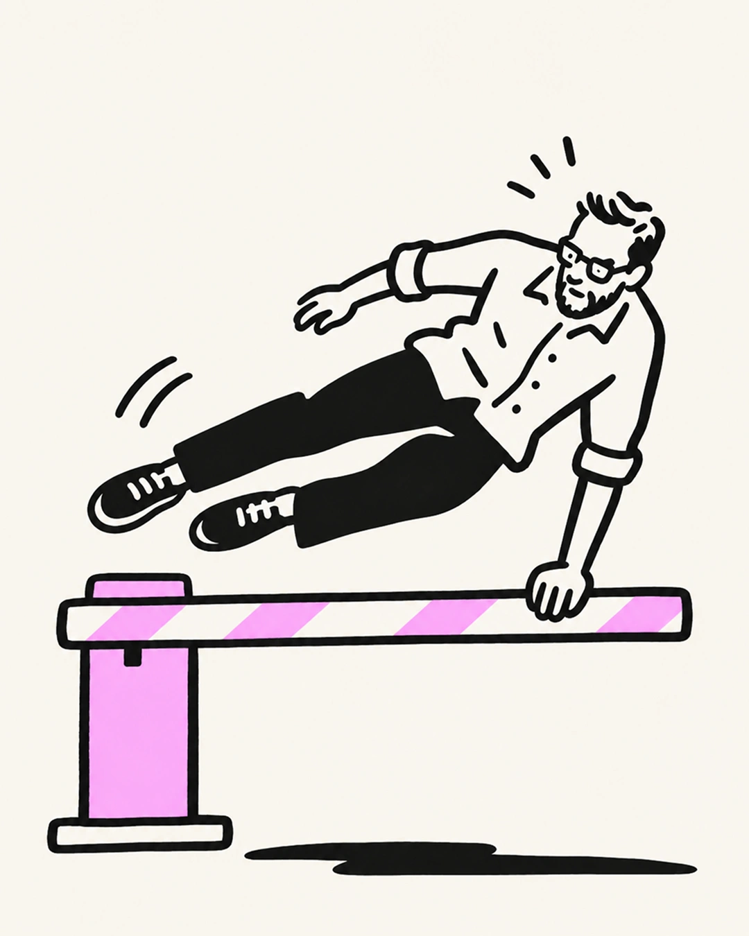
I have a soft spot for improvised signs. The handwritten directions taped to a wall, the extra arrow pointing towards an entrance, the note explaining something that probably should have been obvious.
They're not pretty. Most are terrible. But they're usually there for a reason.
In Singapore's railway stations, staff have been creating their own paper signs to help passengers navigate confusing routes and find the right exits.
There's something amusing about a professionally designed wayfinding system needing help from a piece of A4 paper.
We spend time creating systems that are consistent, carefully considered and visually coherent. Then people start using them and discover things we hadn't anticipated.
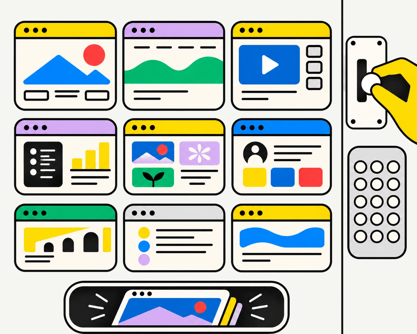
The same happens online. Customers open several tabs to compare information that could have been presented together. They contact support because an answer is buried somewhere on the website. They take screenshots to remember information they can't easily find again.
These little workarounds deserve attention, particularly when reviewing a website's content architecture or how a brand experience works in practice.
Not every improvised solution means the original design has failed. People have different needs, and no system can anticipate every situation.
But when enough people start inventing their own instructions, perhaps it's time to reconsider the original ones.
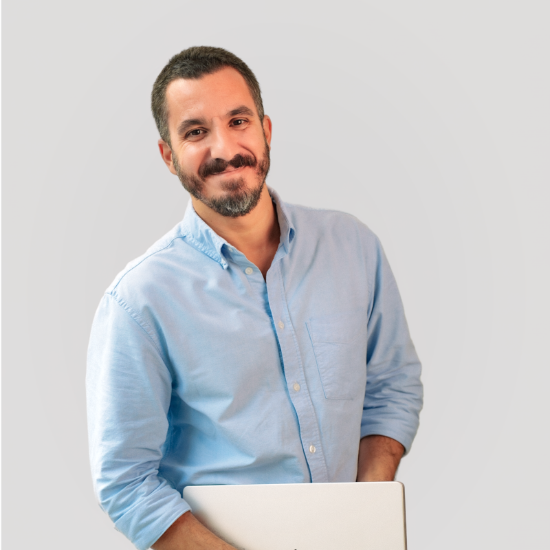
Francisco Belo dos Santos shapes brands through strategy, identity and digital experiences. Based in Dubai and born in Lisbon, he brings an international perspective shaped by diverse cultures and markets, combining strategic thinking with a belief in purposeful design.

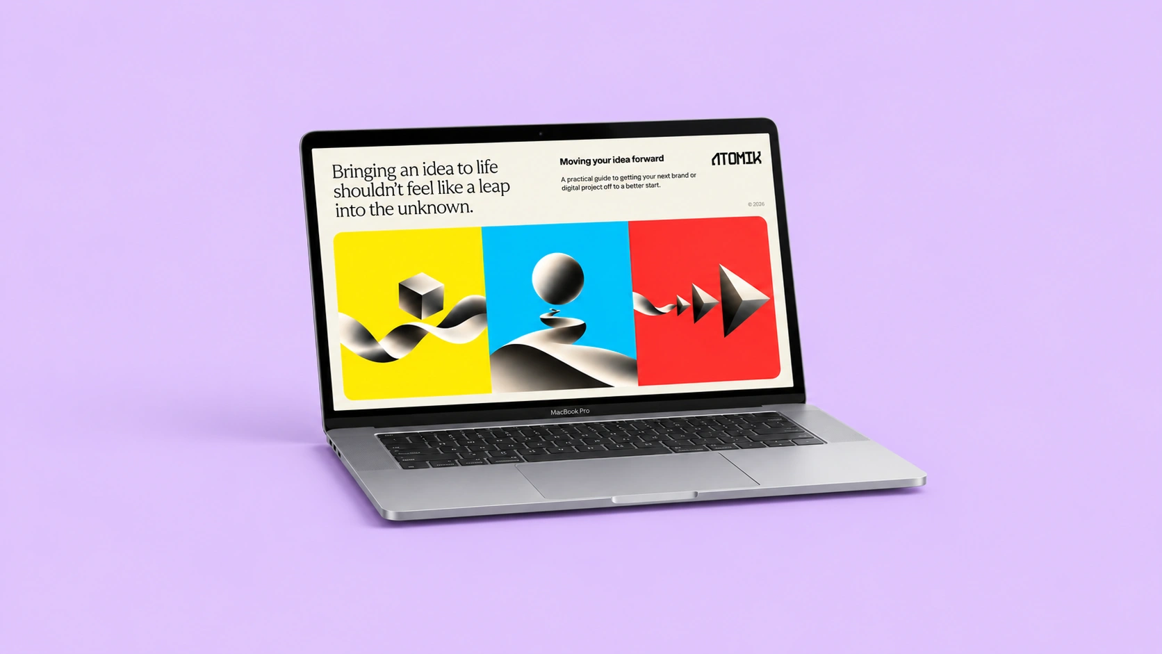
Clarify your challenge, set priorities and prepare a brief for your branding or design needs.
Strategy, identity and digital experiences come together in different ways. Here's a selection of projects shaped by different challenges, ambitions and opportunities.
Explore selected projects ↗Developing something new, rethinking an existing brand or considering a different direction? Tell me what you're working on and we'll take it from there.
Start a conversation ↗