Feel free to reach out:
hello@atomik.studio
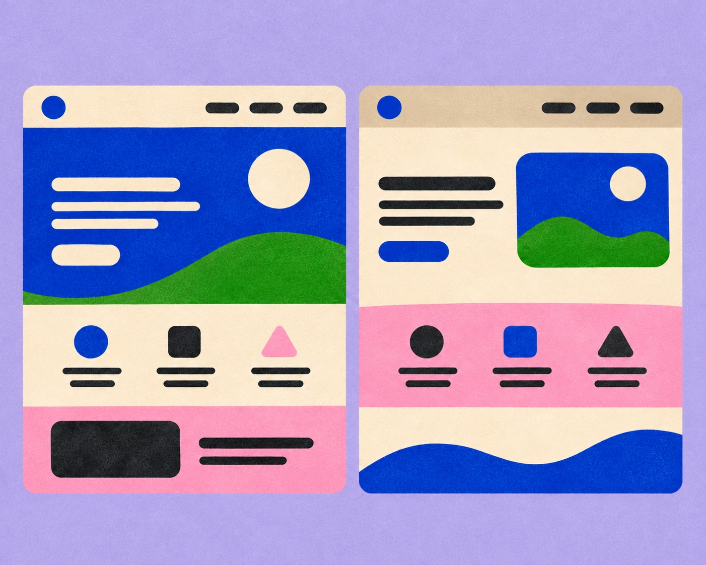
A business might begin with a website. Later comes a customer portal, perhaps an app, an internal dashboard and a separate platform for partners.
Each product has its own requirements. They may also be designed by different teams, at different times, using different technologies.
Before long, the business has several digital products that barely seem to know each other.
Creating consistency across them requires more than sharing the same colours and logo.
A marketing website and an operational dashboard serve very different purposes.
The website might need expressive typography, strong imagery and carefully considered transitions. A dashboard used for eight hours a day needs to make complex information easy to understand.
Applying the same visual rules without considering those differences can make both products worse.
Before designing the system, map the products, their audiences and the tasks people need to complete. This is where website strategy is useful, before interface decisions become expensive to change.
Consider what genuinely needs to remain consistent and where the experience needs more flexibility.
A customer logging into a service should recognise the business. They shouldn't have to work through decorative elements that were originally designed to make the homepage look impressive.
A brand's visual identity and a digital design system overlap, but they aren't interchangeable.
Brand guidelines might define typography, colour, imagery and the overall character of communications.
A digital design system needs to go further. It should establish how buttons behave, how forms handle errors, how information is organised and how components respond across different screens.
Both systems should come from a shared set of principles.
A brand that values clarity, for example, should reflect that in its visual language and in the way its interfaces communicate information.
That doesn't mean every screen has to look like an advertisement.
It means the same attitude should be recognisable throughout.
Not everything needs to be identical across products.
Shared elements might include typography, colour tokens, icons, spacing conventions, accessibility standards and common interaction patterns.
Other decisions should remain specific to the product.
A mobile app may need compact navigation that wouldn't make sense on a desktop dashboard. An internal platform might use a denser information layout than a public-facing website.
It's useful to distinguish between components that should be reused, principles that should be followed and exceptions that are genuinely necessary.
Otherwise, consistency becomes an argument for copying something that doesn't quite fit.
A component library looks convincing when every element is displayed in its ideal state.
Real products are less accommodating.
Names are longer than expected. Information is missing. Forms return errors. People enlarge the text. A screen needs to work in another language.
These scenarios should inform the system from the beginning.
Test the components with actual content, including the awkward cases. A table displaying three sample rows tells you less than one handling twenty records with complicated labels.
The same applies to localisation. A layout developed for English may need significant adjustments for Arabic, including right-to-left navigation and different text lengths.
A good system anticipates variation instead of treating every exception as a problem to be patched later. That's also why website testing needs to cover real content and behaviour.
Design systems need maintenance.
Someone has to decide when a new component is necessary, when an existing one should change and how updates reach different products.
Without ownership, teams gradually create their own solutions. Two products might use buttons that look similar but behave differently. Different versions of the same component become difficult to maintain.
Document decisions, establish a process for proposing changes and make the system accessible to the people building and managing the products.
This connects with the broader challenge of brand rollout. Creating the system is one part of the work. Getting people to use it consistently is another.
A shared design system should make products easier to use, build and maintain.
Look at whether teams are reusing components, how often they need exceptions and whether common interactions remain consistent across products.
User testing can reveal where a shared pattern works well in one context but creates problems in another.
A system that saves development time while making the experience harder for customers isn't necessarily an improvement.
It should also be reviewed as the business grows. New products may expose requirements nobody anticipated when the original components were created.
That's a reason to evolve the system, not abandon it.
Afternow's work for healthcare transportation platform Kinetik offers a useful example of the scale involved. The studio has worked across its identity, website and four digital products, with each part serving different needs.
The task isn't simply to make everything look related. It's to create a shared foundation that can accommodate those differences.
For businesses managing several digital products, this is where brand architecture and digital product design become closely connected. People should understand the relationship between the services without having to learn an entirely different interface each time.
A strong brand system gives different products enough in common to feel connected and enough flexibility to work properly.
The goal isn't to make every screen look the same. It's to make the whole business feel like it belongs together.
What's the difference between brand guidelines and a digital design system?
+Brand guidelines define how a brand communicates and expresses itself. A digital design system translates relevant principles into reusable interface components, behaviours and technical rules.
Should every digital product use the same components?
+Not necessarily. Common patterns should be shared where they improve consistency, but each product may require components suited to its users and tasks.
When should a company create a shared design system?
+Usually when teams begin repeating interface work across products or when inconsistent patterns start affecting usability, development or maintenance.
Who should manage a digital design system?
+Ownership should be clear and involve both design and development, with a defined process for reviewing changes and incorporating product requirements.

Francisco Belo dos Santos shapes brands through strategy, identity and digital experiences. Based in Dubai and born in Lisbon, he brings an international perspective shaped by diverse cultures and markets, combining strategic thinking with a belief in purposeful design.

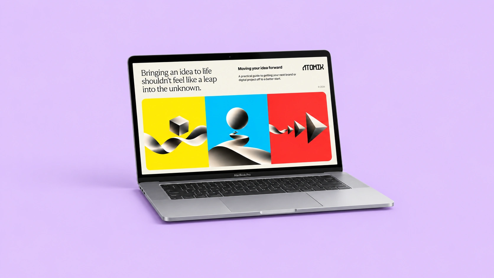
Clarify your challenge, set priorities and prepare a brief for your branding or design needs.
Strategy, identity and digital experiences come together in different ways. Here's a selection of projects shaped by different challenges, ambitions and opportunities.
Explore selected projects ↗Developing something new, rethinking an existing brand or considering a different direction? Tell me what you're working on and we'll take it from there.
Start a conversation ↗